

Updated December 2025
Getting ready to offer your graphic design skills to the world?
Before you begin applying for jobs or going after clients, it’s good to be aware of common missteps that can derail your efforts and damage your credibility.
After all, everyone makes mistakes—especially when they’re just starting out.
But knowing about the pitfalls you might encounter can help you navigate the field and get your design career off to a smoother start.
In this post, we outline five common blunders new graphic designers make and provide advice on how you can avoid them.
Let’s dive in.
MISTAKE #1: NOT FOLLOWING THE BRIEF
Some new graphic designers charge ahead without fully understanding what the client is looking for.
They might think they know what’s required, but they fail to clarify key points of the brief.
Worse, they might make design decisions based on their own tastes or preferences, or suggest solutions that are too costly or time-consuming.
That can result in a lot of wasted time and effort when the final product doesn’t do what it’s supposed to do: solve the client’s problem.
How to avoid this mistake: Read the brief carefully and ask as many questions as necessary until you understand the client’s goal, project budget, deadlines, and expected deliverables. Don’t make assumptions.
Offer creative suggestions, but always remember the target audience—you’re designing for them, not for yourself. And be sure to stay within the constraints of the brief (budget, time frame, etc.)
MISTAKE #2: OVERCROWDING THE DESIGN
Many new graphic designers overfill or saturate their work, forgetting the value of clean and simple whitespace (also known as negative or blank space).
Whitespace guides the eye across the page and gives it a place to rest. When used properly, the overall effect is one of balance and harmony.
The Google home page is a good example. The simple, calming design lets the viewer focus on what they want to do: run an online search.
But when a design is too cluttered and crowded, it’s hard for the viewer to sort through it and find the main message. They won’t know where to look; it’s just too overwhelming.
 Poor use of negative space can confuse and overwhelm the viewer
How to avoid this mistake: Use whitespace to visually organize and structure your content. Focus on guiding the viewer’s eye along a clear path so that your design has the greatest possible impact.
MISTAKE #3: BLINDLY FOLLOWING TRENDS
New designers often want to implement a certain style because it’s currently popular. But while staying informed about graphic design trends is important, you shouldn’t rely on them for all of your design decisions.
For one thing, trends obviously come and go. Getting swept up in them can mean your work quickly becomes outdated. That’s particularly dangerous when it comes to logo designs, which should be more enduring and timeless.
For another thing, you don’t want your portfolio to look like everybody else’s. You’ll serve your clients best by being unique.
How to avoid this mistake: Let current trends inform your designs, but be sure to add your own touch. Don’t let yourself be too easily swayed by fads.
Senior graphic designer Ben DeBlois says that’s how he approaches his work.
“I keep up with current trends by reading online articles and following some social media accounts, mostly on Instagram. I follow my own style and instincts but always keep the trends in mind.”
MISTAKE #4: TAKING THE LAZY WAY OUT
Don’t make the mistake of overusing a design element just because you’re comfortable with it.
You need to come up with a design solution that meets the unique needs of the client and resonates with the target audience—even if that means using a font or colour scheme or design style that you’re not super familiar with or aren’t especially fond of.
Other big no-nos are overusing stock photos or creating a design that’s overly similar to what your client’s competitors have.
How to avoid this mistake: Originality should be your byword. Don’t get so attached to a certain look that you get into a rut and use it for every client.
Use stock images sparingly, and make sure you edit or modify them so that your design stands out from the crowd.
MISTAKE #5: NOT CHECKING THE FINAL PRODUCT
Even experienced designers often fail to proof their final designs. But this is an absolutely crucial habit to get into.
Typos can be seriously embarrassing for both you and the client. Imagine missing the “l” in “public,” for example. Or getting the name of the product wrong.
But spelling isn’t the only thing that can go awry. You should also look closely for alignment problems or other issues that can interfere with your intended message.
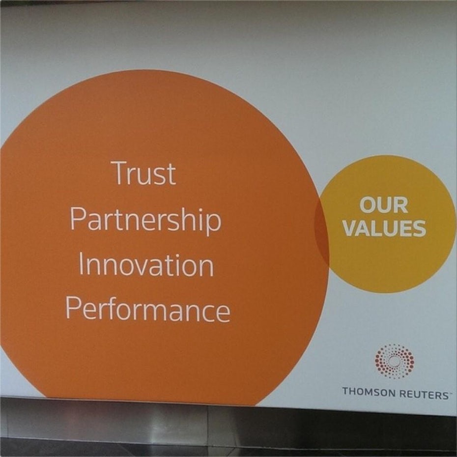 Not the most effective Venn diagram ever (Source: Penji)
How to avoid this mistake: Always, always, always check over everything before you submit your design. If possible, have someone else look at it so that you get a fresh perspective.
INTERESTED IN LEARNING MORE ABOUT DESIGN?
A certificate program can be a great way to master the fundamentals, get comfortable with industry software, and build your design portfolio.
It will also help you shake off any bad design habits you may have already formed.
At Herzing College, our 10-month design training even includes an internship, so you can practise your skills alongside the pros and get some real-world experience.
Want to learn more? Click below.


